
PhantomBuster: Conversion
Christian Seidel
Guillaume Bruère
Johan Roques Casspe
2023
Senior Product Designer
PhantomBuster is a lead generation and outreach tool for sales and marketing professionals. The product is made up of a broad range of automations, primarily for social networks like LinkedIn, Sales Navigator, Google Maps and Instagram. These automations are called Phantoms. Each Phantom performs a set of actions on behalf of the user, saving them time on lead generation and outreach activities.
Increasing PhantomBuster’s conversion rate to impact revenue in the short term
The initiatives were split between Retention (short-term anti-churn and reactivation tactics) and Acquisition (tactics to drive conversion from free trial to paid plan). The conversion funnel tells us that 76.9% of new users successfully launch at least 1 Phantom. We see a big drop-off between the first launch of a Phantom and subscription purchase. Only 1.22% of new users convert to paying customers! Here are some of the questions we asked ourselves:
What happens once a user launches their first Phantom?
Are they satisfied with the results but no longer need our product?
Are they dissatisfied with the product and not getting value?
This case study will walk through a series of experiments that the Product team implemented in order to address the conversion challenge.
-
![]()
This funnel shows a huge drop-off between a user finishing an automation and a user purchasing a subscription.
-
![]()
Only 1.22% of new users convert to paying customers.


Helping users find the right task automations
PhantomBuster provides a broad range of Phantoms (automations) across many social networks. These Phantoms were listed in a catalogue which, at the time, lacked robust filters and were categorised by platform and task, rather than use case or job-to-be-done. This made the catalog overwhelming for new users to explore and select their next best action.
I worked with PM, Guillaume and PMM, Johan, to create a catalogue which would put use cases at the centre of the experience and provide robust filters to help the user find an appropriate automation for the task at hand.
-
![]()
Phantoms categorised by use cases, platforms and data required by the Phantom.
-
![An image of the Float House.]()
Displaying recommended Phantoms to show users their next best action and other compatible Phantoms.


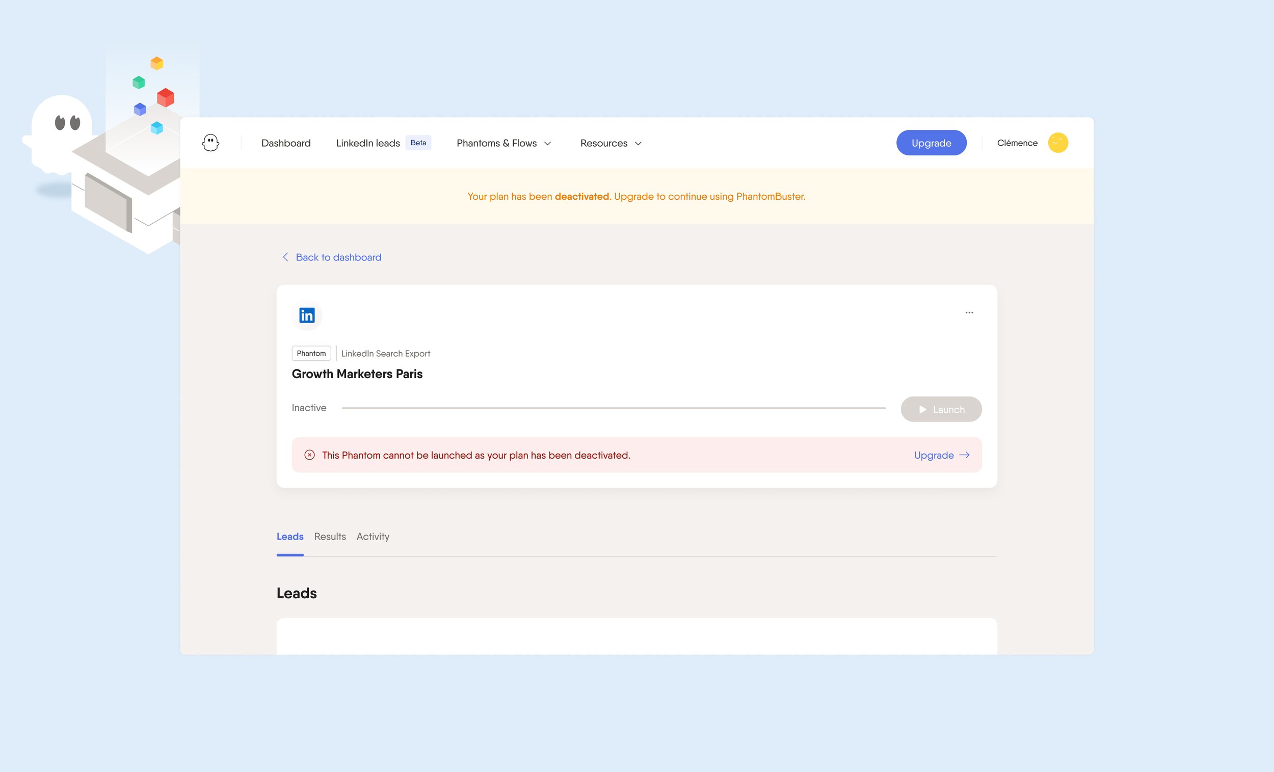
Improving the UX of the payment flow, decreasing CS tickets by 50%
Customer support were receiving a large number of tickets from users who subscribed to the wrong subscription plan. When a user switched or reactivated their plan, the pricing page would default to annual billing, rather than the user's last payment setting. This meant that when monthly plan users were going through the payment flow, they would be defaulted to annual billing. There was no payment summary to clearly indicate the total price they would have to pay, resulting in an unintentional overpayment.
I updated our payment flow to change the billing to the user's last payment settings. I introduced a payment summary, a summary of the selected plan and the last 4 digits of the credit card we had stored. My goal was to payment the payment flow as transparent as possible to the user. Due to back-end limitations, we were unable to display prorated payments nor the VAT in the payment summary, however, these small interventions led to a 50% decrease in customer support tickets.
-
![]()
Ensuring that the pricing page defaulted to the user’s last payment setting (i.e. monthly or annual)
-
![]()
Introducing a bill summary, a summary of the selected plan and the last 4 digits of the stored credit card.


Driving customers towards the ah-ha moment
Approximately 28.9% of new users experience an error when setting up a Phantom for the first time. Although most users are able to troubleshoot the error and launch their first phantom, 4.5% of new users are unable to. Not a great first impression of the product! When we looked at the error codes for an unsuccessful launches, we saw that:
45% of errors were related to session cookies (invalid or missing)
27.5% of errors were related to the wrong input type
8% of errors were related to an invalid Phantom configuration
What is the relationship between successful launch and purchasing a subscription?
It turns out that a user is 1.7x more likely to buy a plan if they successfully launched their first Phantom. This was an opportunity to decrease the number of errors encountered by a first time user through simplifying the UX of the Phantom setup, deliver value quickly and thereby increase the likelihood of conversion. I separated the advanced user settings into it's own tab, in order to simplify the interface. I introduced default values into the fields, so that a user could successfully launch a Phantom without changing any setting. Finally, I split the input types on the first step so that it was clear what type of URLs were required for the Phantom to successfully launch.
-
![]()
Displaying the different data types to ensure users fed the Phantom the appropriate URL.
-
![]()
Introducing default values into the fields to make the Phantom run smoothly.
-
![]()
Guiding the user towards the appropriate number of automations to prevent shadow banning.
-
![]()
Separating advanced settings from the main flow of the Phantom setup.


Removing loopholes in the freemium model
After a free two-week trial period, users were downgraded to a “Free Forever” plan. They would have access to 1 slot and 30 minutes of execution time. This freemium model meant that some people created multiple free accounts in order to use our product without paying for a plan.
Although we did not anticipate that removing the “Free Forever” plan would have a significant impact on conversion, we agreed that it would be wise to remove this loophole from our product. My role was to assess the impact on the UI and resolve any UX incompatibilities as a result of removing the “Free Forever” plan.
Incentivising customers to maintain their subscription during the cancellation flow
Upon cancellation, users would be prompted to select a broad reason for cancelling their subscription. Users were not required to provide us with feedback on the product. I worked with Guillaume to create a new cancellation flow that included specific cancellation reasons, incentives to keep their subscription and a required field for feedback.
The purpose of this re-designed cancellation form was to provide the Product team with new insight on potential features for long-term improvement and give us qualitative data on where the product was failing to meet the needs of our customers. We offered incentives like a discount on their subscription for a limited time and directing them to customer support, in the case where they were unable to troubleshoot a problem.
The importance of ensuring that the level of friction doesn’t outweigh the benefits of the product
I left PhantomBuster before definitive results were gathered from the experiments that the Product team implemented and therefore, I am unable to comment on the effectiveness of these interventions. The Product team and I took a data-informed approach to breaking down the problem and I think we made appropriate bets with the information we had available.
Around the same time, I began a research project with the Head of Customer Success, Claire, to understand which use cases have a higher natural frequency and what do these users see as the biggest value add. We found that many of the users we spoke to were using PhantomBuster to grow their LinkedIn profile and find leads on LinkedIn and Sales Navigator. When it worked, it worked well for them and continuously generated a steady list of leads.
When the product didn’t work well, the friction of getting set up sometimes outweighed the potential benefits. My experience at PhantomBuster highlighted the importance of a frictionless user experience and it’s impact on the bottomline. The level of user experience has matured over the years that any friction in a product experience is not always tolerated by users.